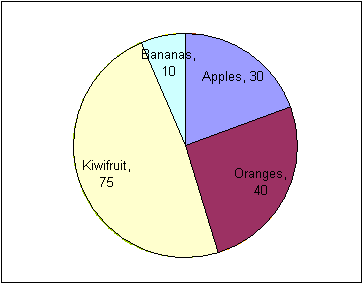
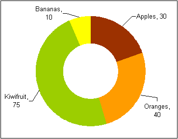
If a doughnut chart is just a pie chart with a hole in it, why then does it behave so differently from a pie chart, for example when it comes to creating and positioning chart labels. In a doughnut chart, you can’t just drag the chart label outside of the wedge to create a label with a leader line.
Can leader lines be added to doughnut charts?
Sure. But you’ll need to use a little trick.
Excel is sometimes a tad inconsistent. It’s easy to create a pie chart with data labels, pull the data labels away from the pie to create leader lines that link the labels with the wedges. No big deal.
Now, a doughnut chart is basically a pie chart with a white hole bitten into the center. But for some obscure reason that totally escapes me, it’s not possible to create leader lines in a doughnut chart. With a pie chart, you simply drag the data labels away from the chart a bit, and, voila! Leader lines. With a doughnut chart, you can drag the data labels all you want, but leader lines will not appear.
Ok, then. On to a little tricking. Let’s start with some sample data:

Step 1 – create the doughnut chart
First, let’s create a doughnut chart straight from the standards, delete the legend, change the wedge colors and add data labels for category and value. That will look something like this:

Step 1 – doughnut chart with data labels
Step 2 -Add the same data series as a pie chart
Next, select the data again, categories and values. Copy the data, then click the chart and use the Paste Special command. Specify that the data is a new series and hit OK.
You will see the new data series as an outer ring on the doughnut chart. Click the new, outer ring and change the chart type to Pie chart. This new pie chart will sit on top of the doughnut chart, effectively obscuring it. But you can still see the data labels for the doughnut chart.

Step 3 – Add data labels for the pie chart
Select the pie chart and add data labels. They will be positioned outside of the pie. Click each data label and drag it a bit to see the leader lines appear.

Step 4 – Hide the pie chart
Now that the data labels and the leader lines are in place, we can hide the pie chart. Click the pie, open the format dialog and set the borders and fill options to “none”. After that, the chart should look like this:

Step 5 – Delete the original doughnut chart data labels
One final finishing touch: Click the doughnut chart labels and hit the delete key. There: A doughnut chart with leader lines.

Now, that wasn’t so hard, right?. I wonder why Microsoft never got around to including leader lines for doughnut charts as well as pies.
For a taste of doughnuts and fruit, download the attached file (created with Excel 2003).
Hi, I can seem to follow Step 2, I copy the data, click on the Chart and use Paste Special command and nothing happen. Could you please help me on what have I missed?
LikeLike
Many thanks in advance
LikeLike
What’s your Excel version?
LikeLike