When I work with PowerApps forms for SharePoint lists, I often use a horizontal layout with several columns to avoid having to scroll through a long list of fields. Sometimes I would like individual cards to be wider or higher than the default. It is easy to drag the width of a card so it is several columns wide. That is awesome.
But each row is always as high as the highest card in the row, and it is not possible to have a card extend over several rows.
For example, I would like to arrange several smaller cards stacked vertically, side by side with a card that has a big text box.
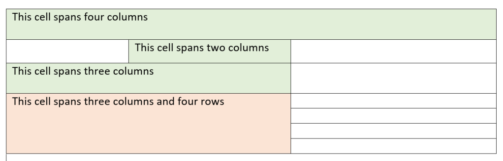
Such a layout is very easy to do in Word or PowerPoint by merging rows and columns. HTML tables have parameters for colspan and rowspan. But in a PowerApps custom for for a SharePoint list, this is not easy to do. The table below illustrates what I mean. The green column spans are possible, but the red cell spanning several rows is not.
At least not by just arranging cards on the PowerApps form. In this blog I will show you what you need to do to get a form layout like this one:
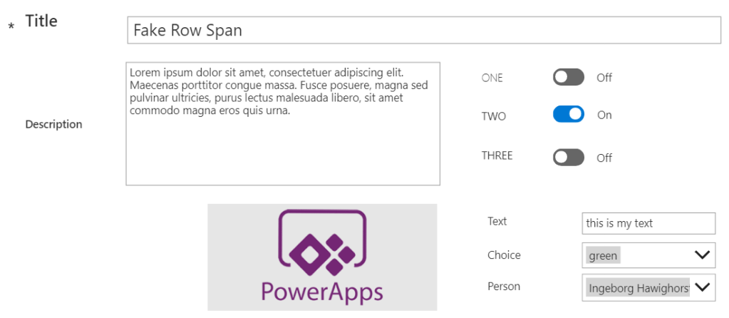
I assume that you already know how to customize a SharePoint list form in PowerApps and that you have changed the screen size to a landscape orientation. Change the properties of the SharePointForm1 to use at least two columns and turn the Snap to columns off. A form with a few fields should then look similar to this:

You can see that the toggle control card is as high as the multi-line text card. I want the three toggles to be stacked on top of each other and arranged next to the multi-line text card, so the text card would have to span three rows.
Here is how I did it.
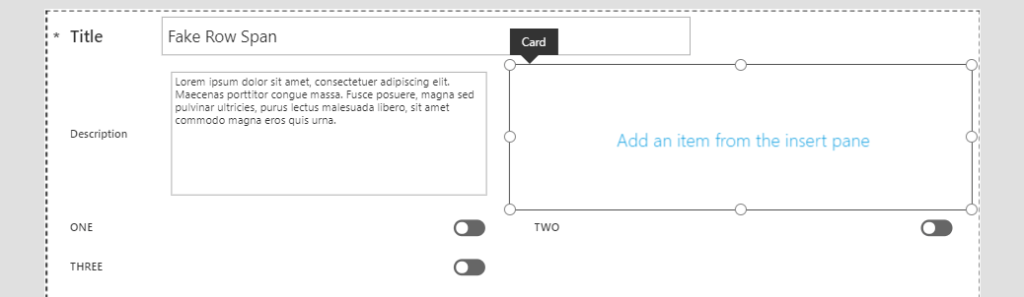
Create an empty custom card
Select the form (probably still called SharePointForm1, and in the right hand side Properties panel click Edit fields. Click the three dots at the top and then select Add a custom card.

Arrange the new custom card so it sits next to the card with the multi-level text field. You can do that by dragging the custom card in the field list, or by changing the X and Y position of the card in the Advanced settings of the card.
With the new custom card still selected, add three labels to the card, one for each toggle field, and arrange them vertically.
Copy the original control
Now select the control in the original card and copy it. You can use the keyboard shortcut Ctrl+C or right click and select Copy from the context menu.
Then click the empty custom card and use Ctrl_V or the right-click Paste command to paste the control into the custom card. You will notice that the control shows a red x to indicate that there is something wrong with it.
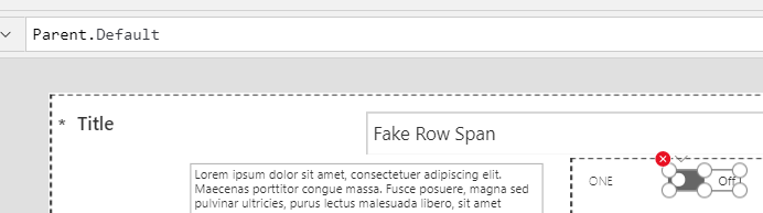
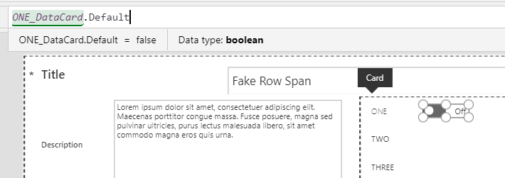
Click the down arrow on the error indicator and select Edit in the formula bar. The formula bar shows the formula Parent.Default. This property makes sense in the original card, which has a default setting for the toggle control. We need to re-establish the link back to that original card.
Whenever I reference cards or controls by their name, I usually edit their names and write in something more meaningful than the default that PowerApps generates. My three data cards for the three Yes/No fields are called ONE_DataCard, TWO_DataCard and THREE_DataCard, and I renamed the three original toggle controls to OneToggle, TwoToggle and ThreeToggle.
Change the Parent part of the formula to the name of the original card. In my case that is the ONE_DataCard, so the complete property now reads ONE_DataCard.Default and the red error indicator has gone away.
Repeat that process for the other controls that you want to place in that card.
Due to their default settings, these controls will now inherit their values from the original data cards. Next, we need to make sure that these controls send their changes back to the SharePoint list columns.
Link the input controls to list columns
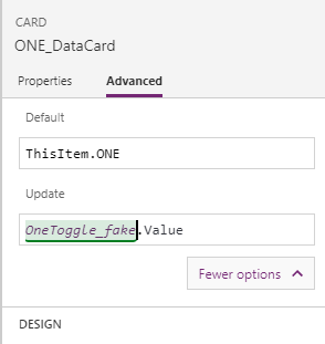
Inspecting the original cards, there is one property that is responsible for updating the SharePoint list column when edits are made. It is visible in the Advanced section of the data card, but only after clicking on the button for More options and is called Update.
Out of the box, this command refers to the control in the current card and returns the value of that control. The exact command to return a control’s value will depend on the type of control. A text control will use ControlName.Text, a combobox dropdown will use ControlName.Selected and a toggle will use ControlName.Value. But we don’t really have to worry about that, since we only copied the control and did not change its type. So, all we need to do is update the control name that the command is referring to.
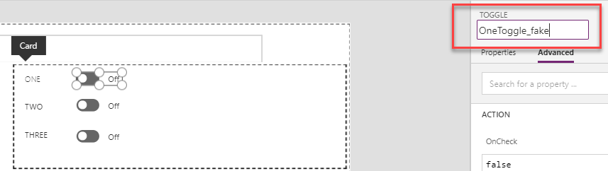
When copied and pasted the control to the custom card, the copied control name ended up with a _1 at the end. So copying OneToggle resulted in the name OneToggle_1. I’m not a big fan of numbering copies, because it is easy to lose track of what copy number is for what purpose. To stay in control (pardon the pun), I renamed the controls in the custom card to something more meaningful. I added a _fake at the end of the control copies.
Now it’s really easy to link the Update property of the original data card to the control that is used for data entry. Select each of the original controls and change the Update property to point to the copy of the control.
I did this for the remaining toggle controls. Just for kicks, I applied the same approach on the next row, this time using two custom cards side by side. The left hand custom card contains an image, and next to it, neatly stacked on top of each other, are three controls: a text box, a choice drop-down and a people picker.
Since I copied the controls from the original data cards, all the definitions of the control, for example the choices for the drop-down, were copied with the control and I didn’t have to make any effort to understand how the control must be configured. You could create a control from scratch but copy and paste is a lot easier.
Hide the original cards
The final step for my custom designed form is to hide the original controls. To do that, select each card in turn and set the Visibility property to False.
After that, the cards have disappeared from the canvas and you can only select those cards in the Tree view on the left.
Important: do not delete the original data cards. You still need them, since they have the connection to the SharePoint list. Only hide them, so they don’t mess up your carfully designed multi-column form that now appears to have a large card spanning several rows.
Here is the final form again:

Did you find this useful? Which of your list forms will you re-arrange this way?
 teylyn
Hello, thanks so much but Power Apps returns me “Circular reference are not allowed”.
LikeLike
If you follow the steps then you won’t get any circular references. Check which formula applies to which control!!!
LikeLike
Worked for me! Thank you for sharing…
LikeLike