Is it possible to sort legend items in a different order than the data appears in the table?
Controlling a legend in an Excel chart can be hard work. Jon Peltier has an excellent article about what influences the order of legend entries here. The bottom line is that it all depends on the chart type, the chart type mix and the distribution of chart series between primary and secondary axis.
Normally, the best way to influence the order of the legend items is to sort the data table and re-arrange the order of the rows or columns, respectively. But sometimes you may not want to do that. Your data table may be precious and the sort order of the items untouchable, but still you may want the legend to show a different order.
Here’s how you can sort the legend items independent of the underlying data table sort. The example shows a clustered column chart, but the principle will apply to any other chart that does not already use the secondary axis.
Let’s start out with some data:
| Nirvana | Neverland | |
| cherries | 4 | 3 |
| dates | 7 | 7 |
| apples | 3 | 4 |
| bananas | 9 | 8 |
This simple table lists the fruit consumption in two different countries. Charted as a clustered column chart, it may look like this, after a bit of formatting and adjusting colours to something digestible:

Note that the legend order is consistent with the appearance of the series in the chart: cherries, dates, apples and bananas, in that order.
Now, imagine your boss wants you to sort the legend alphabetically, i.e. apples, bananas, cherries, dates, – but at the same time insists that the order of the series stays the same. What to do?
Well, enter the helper series.
Create a helper table in your data sheet and place these categories and values into the cells:
| series for sorting legend | ||
| apples | 6 | you will later change these |
| bananas | 6 | values to zero. |
| cherries | 6 | |
| dates | 6 | |
Don’t worry too much about the values in the second colum. We just need something bigger than zero to be able to select the data once it has been added to the chart. And that’s what we’ll do next: Copy the cells from “apples” to the last number in the row labeled “dates”. If this table starts in H1, including the title, then select H1 to I5.
Next, select the chart and then use Paste Special, select “New Series”, “Values in Rows”, “Series Name in first column” and click OK.
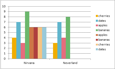
The chart will now look something like this:

Now comes the bit where we need all the concentration we can get. Turn off the radio and send the kids outside.
You need to select each of the four new series and assign them the color that belongs to the series name. So, the first series of the new set will need to turn pink, because it represents apples, the next one goes green, then yellow, then blue.
Once you’ve finished assigning the colors to the new series, check the legend with its eight entries and compare the labels and the colors. After successful color mapping, your chart should now look like this:

Grand. On to the next step: Select each of the helper series and assign them to the secondary axis. Click the series, open the series format dialog and select “Secondary axis. The result should look like this: the secondary Y axis is displayed at the right hand side of the chart and the helper series are overlaying your original Nirvana columns.

Now another tricky bit. Note how the legend now has eight entries, four for the original series, and another four for the helper series. We now need to delete the original four legend entries. Click the legend, then click the top legend label and hit the Delete key. Be careful not to select the legend’s color box for the entry, because then you’ll delete the data series. If the legend now has lots of white space, select it and drag the legend corner points reduce its height to get the legend items stay closer together.
Select and delete all top four series labels, then your chart should look like this:

The rest is easy. Format the secondary Y axis to show no major tick marks, no minor tick marks and no labels. Finally, go back to the data for the helper series up in I2 to I5 and change the values for the helper series to zeros. Now your chart should look like this:

Result: The series order is yellow, blue, pink, green, but the legend items are sorted alphabetically, i.e.
apples – pink
bananas – green
cherries – yellow
dates – blue
Be aware that if you change the category order in the helper series in H2 to I5, you will have to re-create the color mapping if you still want to make sense of your chart.
The attached file has been created in Excel 2010 and saved as an Excel 2003 compatible file.