The challenge: A column chart needs to show two sets of columns and have a trendline for each set of columns.
The screenshot below shows the desired outcome.
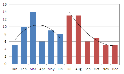
This post describes how to create this chart in 10 simple steps.
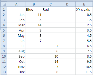
First, let’s arrange the underlying chart data:
Step 1
Create a column chart with two data series: simply select a cell anywhere in the table in columns A to C and click Insert > Column > 2D Column. Accept the defaults and delete the legend.
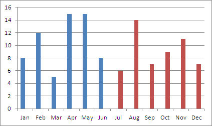
Step 2
Add the data for the blue series again, but this time select only the populated cells in column B, i.e. =B2:B7
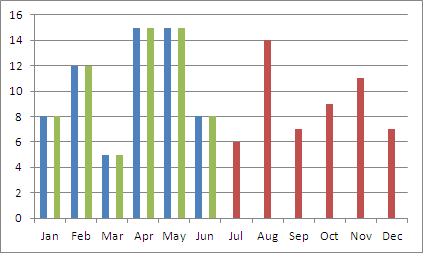
Step 3
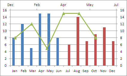
Change the chart type of the new series to XY scatter.
Step 4
Edit the data source of the green series and use the values in column E for the X values, i.e. =E2:E7

Step 5
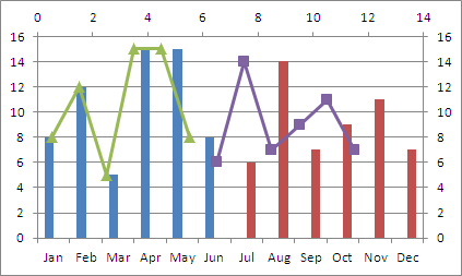
Add the populated cells from column C as a new series with X values from column E, i.e.
X values =E8:E13
Y values =C8:C13
Step 6
Adjust the maximum value of the secondary X axis. The maximum value needs to be identical with the number of columns in the chart. In this example, the chart has 12 columns, so the maximum value for the secondary X axis needs to be set to 12.
Step 7
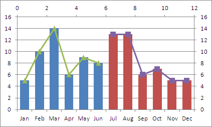
Format the columns to have 100% overlap and a smaller gap.
Step 8
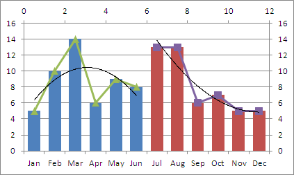
Add a trendline to each of the XY series.
Step 9
Hide the XY series by formatting them to have no line and no marker.
Step 10
Hide the secondary X and Y axes by formatting them to have no tick marks and no axis labels.

Done. Download the sample file here: SideBySideTrendlines.xlsx
cheers, teylyn