Introduction
In the first part of this mini-series, minimum and maximum values of a chart were showcased by simply sorting the data values in ascending or descending order
But…
There may be situations, where the order of the data points may not be changed, for example because they are in a chronological order, or because the data points are sorted alphabetically, so they can be seen in relation to other charts with the same alphabetical order.
With the data values in alphabetical or chronological order, it can be hard to identify the highest and/or lowest data point, so a few visual pointers may be called for.
So, here’s an alternative to sorting the values:
Conditional colouring of the columns
To highlight the minimum and maximum values of the data set, we can colour the minimum values red and the maximum values green. This solution is also dynamic, of course, so that any changes in the base data set will be reflected in the chart without user intervention.
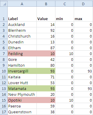
We need two additional data series in helper columns, one for the minimum and one for the maximum data value. These will also show if a max or min value is present more than once.
The minimum value of the data set can be obtained with a formula like
=IF(B2=MIN(Value),B2,0)
The maximum data value can be calculated with
=IF(B2=MAX(Value),B2,0)
These two columns are added to the base data table to provide a scenario like this (I’ve applied conditional formatting to highlight the minimum and maximum values in the source table):
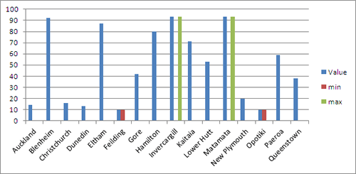
Plot all three data columns as a clustered column chart, with the town names as the X axis labels. That should produce a chart like this:
Double-click any of the columns to format the data series. Set the series to 100% overlap and decrease the gap width to 50%.
Delete the legend and the grid lines to arrive at this:
The maximum data points are green, the minimum data points are red — and that even applies to duplicate values.
View the Excel file in Excel Web Apps or download a sample file.
In the next post I will show how to use an image to highlight the minimum and maximum value.
cheers, teylyn


