Introduction
In this mini-series I’m showing how to draw attention to high and low values in Excel charts. In the first part of this mini-series, minimum and maximum values of a chart were showcased by simply sorting the data values in ascending or descending order. Part 2 looked at conditional formatting the columns themselves if they were the highest or lowest value in the chart.
This post shows a different approach.
Stacked columns with image fill
If you would like to retain the original colour of the chart columns, you can use another technique to highlight the maximum and minimum value: an image, for example an arrow, can sit on top of the maximum or minimum value bar and draw the reader’s eye to it. You will need two images, like coloured arrows or happy/unhappy faces or similar in a folder on your hard drive.
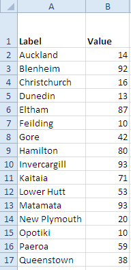
First we need to prepare the data table. The original data table looks like this:
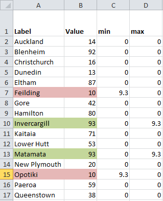
Now we add two columns to the source table. The minimum value can be calculated with this formula:
=IF(B2=MIN(Value),MAX(Value)*0.1,0)
To calculate the maximum, adjust the formula to this:
=IF(B2=MAX(Value),MAX(Value)*0.1,0)
Why multiply by 0.1?
The objective is to have a data point on top of the high and low values that has a consistent size. It can then be formatted with an image fill and that image always remains the same size, regardless of the value or height of the data value it is stacked on. Of course, we could use a constant value, like 10 or 150, but if the values of the underlying data have a very wide range, a constant may not be the best choice. A value of 150 stacked on a column that shows 3 Million will not be very visible. Instead, this formula shows a percentage of the maximum value in the chart. Adjust it to your needs.
This formula returns a value of 10 percent of the maximum number in the “value” series, and that will be a consistent size across the chart. Applied to our sample data, the source data now looks like this:
Select this data table and create a stacked column chart. After some minor tweaking (delete the legend, remove the grid lines, decrease the gap width) the result will look similar to this:
Now we can replace the red and green fill for the stacked data points with an image. Select the data point for the maximum value, which will be stacked on one data column. Open the formatting dialog and on the “Fill” panel tick the “Picture or texture fill” option. Browse to the image on your hard drive and select it.
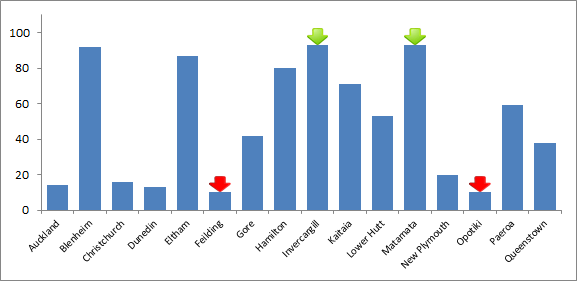
Repeat the formatting for the minimum data series. In this example, I have used a red arrow for the minimum and a green arrow for the maximum data value. The result looks like this:
A sample file with this chart technique is attached.
Conditional Chart Highlights Part 3.xlsx
In the next and final part of the series we’ll explore background fills.
Cheers, teylyn


Hi
I have been using Excel since Excel 3.0 (though I don’t have to use it much) – and this is one of the best trick I’ve come across. Very nice!
thanks
LikeLike