Stock charts can take some time to get used to and are among the more unwieldy charts in the Excel chart palette. They get even more challenging if you want to extend the out of the box chart. Recently, a user asked how to combine a stock chart with a line or XY scatter chart. Trying this out I created a stock chart, then copied the data for an additional series and pasted it into the chart with Paste Special > New Series. I then tried to change the chart type of the selected series to an XY chart, but found that a stock chart cannot be combined with another chart. Excel presents an error information message, saying that “Some chart types cannot be combined with other chart types. Select a different chart type”.

Playing around a bit more, though I found that it is actually possible to just select the newly created data series and format it.
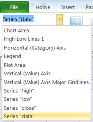
After adding the new “data” series to the chart, select the chart. Then click the “Layout” tab in the Chart Tools ribbon.

On the left hand side of that ribbon, select the newly inserted series in the drop-down of chart elements:
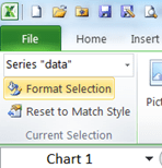
Then click “Format selection” just below the drop-down:
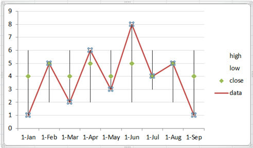
In the format dialog, the series can be given a line color and markers, just like an XY or line chart would take, so there’s really no reason to assign a different chart type to the series. The result looks like this:
Here’s the workbook. Tried and tested in Excel versions 2007, 2010 and 2013. You can change the values in the cells below and see the chart update right here and now. Depending on the speed of your interweb connection, you many need to take a breath or two, before the chart updates. :-). You can download a copy of the workbook by clicking the green Excel icon in the black bar below the workbook.
cheers, teylyn
